Imagine if your editing wasn’t just color and exposure correction. Imagine if you got to play with color and ‘paint’ your raws into works of art every time… would editing feel different to you?
I too, have fallen into a haze of editing; correcting and moving on to get “correct” images for clients during busy season. Letting the colors of clothing, scenery and skin do the work for me of making the image swoon worthy. Running a full time business can cause artists to stick to their process; it produces beautiful images.. So, it’s good right? But then our artistic hearts start to turn to ash as we miss the experimentation that is the core of our creativity.
I want to offer y’all a little play assignment; designed to give you some creative experimentation, a little challenge and better insight into color and how to play with it in Lightroom.
Assignment :
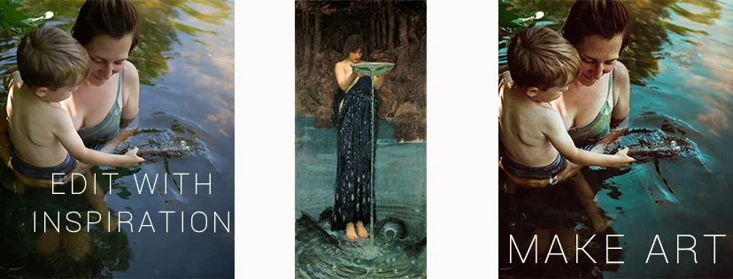
Create a final edit that is a tonal match to a chosen fine art painting. Share in the facebook group for critique, support and advice as you work. Plan to revise at least twice!

Lesson:
Break Down | Step by Step
Step 1.
Go to your pinboard ( wait, you’ve got one of those right? If not, todays the day friend! Designate one beautiful board to all the artwork you’ve ever loved. Favorite books from your childhood, movie stills that stick with you, paintings you saw in galleries for the first time, etc) and pick on work of art to work from.

Download it and size it up to take up about 1/3 -1/2 of your working screen. ( this is important!)

Cicely Mary Barker
Step 2:
Pick a frame you’ve shot before that contains the same basic tonal elements.. we’re not looking for exact matches but we do need something that’s close or in the same range of colors.

Step 3:
Choose your starting base of color correction ( I started with Zayne from ) whether that’s a preset or just your base WB and exposure adjustments.
Step 4.
Zoom in on details and start hand brushing each element to match the tonal ranges in your example. Adjust colors, add colors, GO CRAZY.

Continuously compare your work in close ups and wide views to adjust and readjust and micro-adjust until you are seeing a match.

Remember that the final frame for you won’t EXACTLY match your exemplar because of differences in skin tons, elements and placement of landscape. That’s OK. This is an exercise and should bring you joy in the challenge.
More examples: